Creating a Portfolio Timeline Report in Visio (Part 3)

This post represents the third post in a series on creating a multiple timeline portfolio report within Visio. 

image_thumb1_thumb

For the previous two posts, please see Part 1 and Part 2.

Now that we’ve got this beautiful report, what do we do with it?  Well, the obvious answer would be to publish it to SharePoint using Visio Web Services.  This not only allows us to surface the data, but it provides an interactive interface so that users may click on projects to review more information in the Shape Data Window.

To publish, simply hit File > Save & Send, and select the option to publish to SharePoint as a Web Drawing.

image_thumb7

Note that one of the limitations (I suspect) of the Visio Web Service is that the data will get refreshed, and the shape data and data graphics will be updated on data refresh, but the x,y coordinates of an object will not get automatically recalculated until the Visio report is actually opened in Visio.  Once that’s done, the report will recalculate the locations of the projects, and may then be republished to SharePoint.

image_thumb9[1]

The report may now be used in a Visio WebPart on a PMO dashboard.  The best part, in my opinion, is that users can click on the individual projects and pull up a list of relevant fields directly from Project Server.

Creating a Portfolio Timeline Report in Visio (Part 3)

Creating a Portfolio Timeline Report in Visio (Part 2)

This is the second post in a short series on how to create a simple timeline view of multiple projects in Visio.  The goal is to produce a report that appears as below, and that is dynamically updated from Project Server data.

image_thumb1

In the first post, we reviewed the Visio Timeline behavior and identified the modifications we’ll need to make to support this effort.  In this post, we’ll take those modifications and turn them into a shape stencil.

Create a New Custom Shape

Now that we have identified the default timeline behavior as well as the modifications that we will need to make, let’s go ahead and create our report.  As discussed in the previous post, go ahead and create a new timeline report.  Add the timeline to the top of the page, and configure the date range appropriately.

(In fact, to make life easier for you, I’ll just offer the same template that I developed when writing this post.  Go ahead and download it here.  If you decide to use that, go ahead and skip ahead to the section on Adding External Data.)

If you want to make your own template, then go ahead and make the modifications to the shape as identified in the previous post – with one crucial difference.  Don’t lock down the X or Y axes using protection.  If you’re using the same file from the previous exercise, go back to the Developer tab, select Protection, and uncheck those options.

image_thumb30

Next click on the option to create a New Stencil, then drag the modified interval onto the Shapes window.

image_thumb32

Right click on the new stencil to change the name to something more descriptive.

image_thumb34

Add External Data

The next step is pretty simple.  Click on the Data tab and select the option to Link Data to Shapes.  That kicks off the wizard to link the report to SQL.  Select the PWA Reporting database and the appropriate table.  In this case, I will be using the EPMProject_UserView table for my data source.

image_thumb42

Continue through the default options for the wizard until you get to the point where you have to select the columns and rows to be imported.  I will select the Project ID, Name, Description, Start, Finish, and Project Departments fields.  You may also select other fields that will be displayed whenever the item is selected within Visio.

image_thumb44

Add a filter on the rows if that is required.

image_thumb54

Keep going until you get to the screen where the primary key is defined.  Make sure the Project UID option is selected.  This will allow the items to be dynamically updated from SQL data.

image_thumb48

The data now appears in the External Data window within Visio.

image_thumb50

Now we have to map the fields from SQL to the fields identified in the Shape Data.  Right click on the External Data Window and choose the Column Settings  option.

image_thumb56

Rename the fields so that they correspond to the Shape Data field names.  In the case of Project Description, I simply renamed it to something a bit more user friendly.

image_thumb58

Back in the Visio drawing, select the stencil on the left.  Select one of the projects in the External Data window, and drag it onto the main screen.  The project record will default to the stencil that you have selected.  (Note that you just need to drag the project to the main screen and not onto the timeline.  If you drag the project record onto the timeline, it will revert to the timeline shape and not the customized interval shape.)

Confirm that the Shape Data translated correctly and that the correct color is displayed on the interval.  Change the value in the Row field to move the shape up or down.

image_thumb60

Look good?  Start grabbing projects and dragging them onto the screen.  At this point I ran into either a feature or bug in Visio that caused me a little concern.  Whenever I grabbed multiple projects and dragged them to the screen, the Shape Sheet height formula would default back to the original formula.  When I drag them onto the screen one by one, the correct formula would be applied, and I could modify the location on the sheet with the Row field.

Moral of the story.  Drag each project onto the screen one by one.  It’s a bit onerous, but you only have to do this once, as afterwards the data will get automatically refreshed anyways.  The result will probably look something like this.

image_thumb62

To preclude inadvertently breaking the sync with the timeline, select everything on the drawing, and add X and Y axis protection from the Developer tab.

image_thumb64

From there, it’s a simple matter of displaying the Shape Data window, and manually modifying the Row field to get the report formatted appropriately.

image_thumb3 

Feel free to edit the dates on the projects to improve readability or perhaps to do some what-if analysis on the portfolio.  Once you’ve updated any of the data fields, you only have to click Refresh on the Data tab to pull the latest data from Project Server.  That gives you the option of configuring the refresh process. 

The first time you do so, you may wish to check the option to overwrite your changes with the Project Server data.

image_thumb5[1]

Next up….publishing the report into SharePoint and a brief discussion of issues with the timeline template and the Visio Web Service.

Creating a Portfolio Timeline Report in Visio (Part 2)

Creating a Portfolio Timeline Report in Visio (Part 1)

The other day, one of the end users I support came to me with a sample portfolio report that had been generated manually within Visio.  The question he asked me was whether or not it was feasible to generate something like that out of Project Server data.  Upon review, it certainly looked doable, and it looked conceptually similar to a this post on generating single project timelines in Visio.

Seeing as I hadn’t played around with Visio in a while, I figured it was worth a shot.  Here’s what the final result looked like…

image

First off, my standard caveat.  I am not a Visio expert, nor do I purport to pretend that I know much about the tool.  I can figure out how to do the basic functions that I need it to do, and this case is no different.  I would certainly welcome any and all feedback from a “real” Visio power user on the instructions below.  Even if these instructions end up being wrong, I suppose they make a good starting point for an interesting discussion on the topic.

Another caveat, and a question to the SSRS developers out there….would this be any easier to knock together in SSRS?

…now back to our regularly scheduled program.

Create the Basic Timeline Report

We’ll start by creating a simple timeline in Visio.

image

Add the ruler timeline to the top of the page (or the bottom, I suppose – although you may have to modify these instructions accordingly).  Set the ruler to display the appropriate timeline for your project portfolio.

image

Now add a block interval, which is usually used to represent a single activity or phase. Let’s use this block interval to review the default timesheet behavior.

image

You’ll see that you can change the start and end date of the interval to automatically change the width of the shape as well as the location along the X axis…..provided that you don’t actually grab the shape and drag it off of the timeline.  Once you do that, you’ve broken the connection to the timeline, and changing dates will not control the X axis.

Go ahead, try pulling it off of the timeline and change the dates.  See how the connection has been broken?

image

Now delete the block interval we’ve just created, and let’s add a new one back onto the timeline.  Let’s take a look at the Shape Sheet for this interval.  To get the Shape Sheet to appear in Visio 2010, you’ll need to right click on the Ribbon, customize it, and then add the Developer tab.

image

Once you have the Developer tab displayed, look at the Shape Sheet for the new block interval.  It should look as follows:

image

Note the LocPinY field.  By default, it shows as “Height*0.5,” which represents a Y coordinate relative to the location of the timeline. 

Modify that formula to see how the interval moves up and down on the sheet.  In the following example I’ve changed the formula to “Height*3.”  Positive numbers move the interval down.  Negative values move the interval up over the timeline.

image 

So now we’ve identified that we can control the position and width of the interval by modifying the values of three fields: Start, Finish, and LocPinY.

We’ve also identified, and feel free to check this on your own, that the minute you select the interval and move it around on the sheet, you’ve broken the synchronization with the timeline.  To prevent yourself from inadvertently breaking that synchronization, you can select the interval, and then the Protection option from the Developer tab.  Lock down the X and Y axes.

image

The only way that the interval may be changed now is by changing those three fields identified above.  This also means that the interval will always remain in sync with the timeline at the top of the page.

One more thing to play with while we’re reviewing the behavior of this sheet.  Right click on the interval and display the Shape Data.

image

Right click on the resulting Shape Data window and choose the option to Define Shape Data.

image

Create a new whole number field.  I am calling this “Row,” but feel free to use whatever term you would like.

image

Go back into the Shape Sheet and scroll down until you see Data section.  You should be able to find the newly created field in that section – although whether or not the name is automatically updated appears to depend on the version of Visio that you’re using.

image

In this case, you’ll see that Visio refers to the field as “Prop.Row.”  Go back up the Shape Sheet to the LocPinY field and modify the formula so that it now displays “Height*Prop.Row.”

image

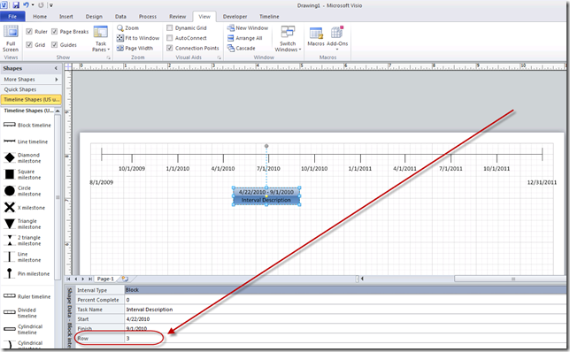
Now, whenever you edit the shape data field, the interval will shift along the Y axis.  As this is all being done through manipulation of field data, the interval will remain safely in sync with the timeline at the top of the page.
image

To make things easier later on, I’d recommend leaving a value of 3 in the custom Row field.  That will help us format the report when we add all of our projects.

Oh yeah….lest I forget, I do have one more thing.  Going back to the original request from my end user, the desired report would color code projects based on a specific parameter such as phase, or status, or in this case, department.

Based on the instructions above, add a second field to the Shape Data called “Department.”

image

Click OK.  Now select the interval, and under the Data tab, select the option to define a new Data Graphic.

image

Configure the data graphic to change the color of the shape based on the value entered in the Department field.

image

Starting to feel good to stretch those long disused Visio muscles.  Next up, saving the modified shape as a stencil…

Creating a Portfolio Timeline Report in Visio (Part 1)

Reporting with Gantt View Task Rollups (Part 2) – Milestone Reporting

I figured I’d clean out my old queue of blog posts that I’d written but never published.  This particular post was half written when 2010 came out, and was sidelined while I soaked up all of the new product goodness.  I then borrowed parts of it for an MVP blog post and never got around to fixing it up.  Since I have a couple upcoming “Tips and Tricks” presentations coming up, I figured it was probably time to resurrect it.

Continuing on in our series on rolling up project data to a single page summary, this post talks about how to roll milestones up to a single summary view.  Note that the Rollup component of this discussion may not be as relevant to the Project 2010 users – as they have access to the Timeline view, which pretty much serves the same purpose.  That’s not to say that the instructions below will not apply to Project 2010, only that there’s an easier way to accomplish the same thing. 

For a look at how to roll up Gantt Bars, take a look at yesterday’s post.

Rolling Milestones Up

Three elements are required to manage the data rollup feature:

1) Format > Layout > Uncheck the first two options.  We’ll talk about how to use this feature in a future post.  For now, I generally recommend turning it off, as it negates the ability to toggle rollups on or off using the default Rollup field.

image

2) Summary Task Level Rollup Field – Setting this to No will turn off all rollup functionality for this specific summary task.  This should be turned on for any summary task intended to be displayed as a rollup task in the Gantt Chart.

image

3) Task Level Rollup Field – Setting this field to Yes will rollup the task to any summary task that also has the Rollup field set to Yes.  If the summary task has Rollup set to No,  this field will not have any impact.

image

For a better description (with screen shots) of the impact of these fields, please refer back to the last post on rolling up Gantt bars.

In the following example, we have a simple project schedule.  I have a number of tasks and a number of key milestones.

image

My goal is to surface the milestones all on a single line.  To do this, I expose the built-in Rollup field, and toggle the summary task and the target milestones to yes.  This selectively rolls up the project milestones.

 image

When collapsing the summary bar, I get a view like this.  Note that one of the major challenges with attempting this approach prior to 2010 is that the text labels often run all over each other.  Additionally, the summary bar somewhat obscures our view of the project. 

image

Both issues are easy to fix.  To correct the text placement, I have two options.  I can opt to create a custom flag field, and tie it to a specific line in the Bar Styles dialog box, thus allowing me to toggle text position through the use of a custom field – or if it’s just a one-off formatting change, I can simply doubleclick on the milestone in question and modify the text placement.  Generally my preference is to use custom fields, as that allows programmatic changes of formatting in the future.  By clicking on the item and changing it, we’re creating a new, separate style just for that one item, which we may not want in the future.  Note that you can also use custom fields to toggle the milestone into a second row to avoid overcrowding the main swimlane.

In this case, however, to keep things simple, we’ll just click on the Project Started milestone, select the Bar Text tab, and move the name from the top to the bottom.

image

Now to remove the Summary bar.

image

Doubleclick on the Gantt Chart to get the Bar Styles dialog box.  Add the “Not Rolled Up” criteria to the Summary bar.

image

And the results are as follows.

image

So why use this instead of the Timeline View in 2010?  In 2010, the Timeline View doesn’t display baseline or progress.  You can’t control which text fields are connected to the milestone in the Timeline View.  With this setup, all of those custom elements may be displayed, yielding a much richer experience.

Reporting with Gantt View Task Rollups (Part 2) – Milestone Reporting